Quantifying Colour
There are billions of monitors worldwide that can reproduce the exact same colour when instructed to. This in itself is an engineering marvel, but it glosses over the fact that this is only possible if there is a standard definition for colours in the first place. Earlier, colours were loosely defined using a limited set of words — most languages have at most twelve words to describe colours. These loose definitions are fine in most cases, but it is not precise enough for describing the tiny differences between similar looking colours that is required for accurate colour reproduction.
The above coloured rectangles shows some of the colours present in the above image. Despite being different, all the shades can be described by the same label — green. One could argue, they can be labelled as lime-green, olive-green, light-green, dark-green, etc to create some distinction. But this naming system is still clunky and highly inefficient. To display the above image accurately, there needs to be a way to describe the all the different shades of green uniquely without needing to resort to an ever-growing list of labels.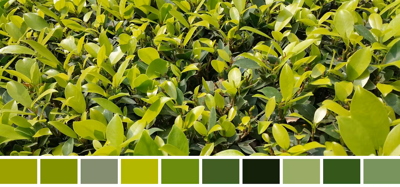
Same name, different colours
Instead of mapping colours to possibly millions of labels, it would be much simpler to use numbered units — the desired precision can then be achieved by simply using more or fewer digits. The idea of mapping colours to numbers might look odd, but it is not too far fetched. Most measurable physical phenomena have already been quantified (for eg. distances, temperature, etc). So if colours can be physically measured it should be easy to map them to numbers, in theory.
Defining colours using numbers also opens up interesting questions: What does addition or multiplication of colours look like? The process of quantifying colours will also reveal why colour hexcodes cannot show enough colours even with 16,777,216 values, and how a dress became a debate on the internet, and why colour blindness exists.
Spectral Power Distribution
The goal is to then measure colours as some physical entity. Unfortunately, colours are a subjective phenomenon. However the fact that most people can agree on the colour of something suggests that there must be at least something objective and physical about it. And there is. Colours are only visible in the presence of light, and that provides a huge clue as to what colours are.
Light is complicated, but it can be thought of as a bunch of wave-like particles, called photons — each carrying some specific amount of energy. The energy of these particles is determined by their wavelength or frequency.
Wavelength The above is an interpretation of a photon, and is not necessarily accurate. The exact shape of photons is difficult to describe since photons exhibit both particle and wave-like behaviour. Trying to visualize photons as both a particle and a wave can get very tricky very quickly.Photon representation
There are photons with different energies (or wavelengths). The different wavelengths of photons together form the electromagnetic spectrum. It is simply the full range photons energies, ordered by wavelength or frequency. The above wavelengths are not to scale.Electromagnetic spectrum
The energy carried by photons can be physically measured, making it trivial to quantify light. To simplify comparisons between different types of light however, the energy measurements are normalized per unit time as power, and then normalized per unit area as intensity — where the area is the total area of the body radiating the photons/light.
So, light sources can be quantified using a singular intensity value. However, for reasons that will become more obvious later, light is actually represented using multiple intensity values — by measuring the intensity separately for photons at different wavelengths. The intensity-per-wavelength distribution is called the spectral power distribution.
450nm Photons The above is an example of a spectral power distribution. The intensity at each wavelength depends on the number of photons at that wavelength and the energy of photons at that wavelength. The energy of a photon is inversely proportional to its wavelength, so the shorter wavelength photons shown above have a higher intensity for the same number of photons.
500nm Photons
550nm Photons
600nm Photons
650nm PhotonsSpectral power distribution
The spectral power distribution provides a way to quantify light. But this is all irrelevant until there is a quantitative way to define a relationship between colours and the spectral power distribution (light) as well.
Photoreceptor Cells
The biggest clue to finding that relationship is rather obvious — colour perception is not possible without light, but it is also not possible without eyes. Eyes are sensitive to light, but more importantly they react differently to different wavelengths of light.
To understand how eyes can distinguish between different wavelengths of light, it helps to know a little bit about human physiology. Eyes have different types of photoreceptor cells that have evolved to respond to photons with specific wavelengths. Unsurprisingly, these wavelengths are very similar to those emitted by the sun (380nm–750nm):
The above is an approximation of the spectral power distribution of the sun. Human eyes have evolved to become sensitive to these wavelengths to be able to perceive environments lit up by the sun.Spectral power distribution of the sun
Photons, depending on their energy (their wavelength), can ‘excite’ certain photoreceptor cells to produce a specific response. The human eye has two kinds of photoreceptor cells — rod cells and three types of cone cells. The different types of photoreceptor cells are sensitive to different wavelengths of light by differing amounts — some cone cells will not produce a significant response to lights with longer wavelengths but other cones may. The sensitivity curves of the different photoreceptor cells are shown below:
The sensitivity curves shown here are normalized approximations (for simpler visualizations and calculations), and are not accurate. In reality, the sensitivity curves are less smooth, and different types of cones have differing levels of sensitivity. For example, the sensitivity of S-cones is significantly lower compared to the other cones. Similarly, rods are more sensitive to light than any of the cones.Normalized approximations
Because of the varying sensitivity curves, the cones can distinguish between different wavelengths of light. Consider a monochromatic light source (a light source with a near singular wavelength). The cones will produce a response to the light, depending on the wavelength of the light and how sensitive the cones are to that wavelength. However, since each type of cone has a different sensitivity, their response will be different for the same light.
Wavelength The first graph is the spectral power distribution of the light source. Since it is monochromatic, the intensity narrowly peaks at some wavelength. The graph below shows the sensitivity curves of the cones. The diagram on the bottom represents the responses of the cones to the monochromatic light. The different cones produce different responses to the same monochromatic light source — because of their differing sensitivity.Photoreceptor cell responses
This is in itself is not enough to help differentiate different wavelengths, but the way the sensitivity curves are (or have evolved to be) distributed makes it such that all different wavelengths will always correspond to a unique set of responses in the cones — making it possible to distinguish different wavelengths. The brain has evolved to interpret these unique responses as perceiving unique colours.
Wavelength
Colour perception
Notice how different wavelengths always result in a unique set of values. Wavelengths that are close to each other may produce similar cone responses and thus the brain interprets them as similar colours. But in general, wavelengths that are distinct will produce distinctly different responses and the brain will interpret them as different colours.
The colour in the above box is how the brain interprets the cone responses as a colour. The colours in the above box (and all subsequent boxes) is however just for illustration — it is an approximation and is not accurate. Also, the name in the above colour box is an example of a word-based definition. Notice here how imprecise they are — the same name correspond to lots of different shades of colours.
Rods are not shown in the above examples because they do not affect colour perception. In well-lit conditions, cones might produce different responses based on the wavelength of light. But in such conditions, the rod cells produce a saturated response since rods are more sensitive to light than cones. Since the response of rods in bright environments is indifferent to wavelengths, it cannot differentiate between distinct wavelengths, and thus does not have a major impact on colour perception — in bright conditions.
Wavelength
Saturated response
The sensitivity of the rods is represented here with respect to the sensitivity of the cones (but it is not-to-scale, and is still an approximation). Because of their high sensitivity, the response of rods remain saturated, and no meaningful information about the wavelength is obtained from the response. The set of cones responses however, remains varied for different wavelengths, and the distinct cone responses can be interpreted by the brain as distinct wavelengths.
In dark environments, rods produce a response when cones do not. But unlike cones, there is only one type of rod cell; there is no other type of rod cell with a slightly different sensitivity curve to help differentiate wavelengths. So, two light sources with different wavelengths can produce the same response in rods, and there is no way to differentiate the wavelengths from the singular response of the rods. The brain evolved to interpret the response of the rods as a singular luminance (brightness) value.
Wavelength
Wavelength ambiguity
Different wavelengths can produce similar responses in the rods, and are thus perceived as similar by the brain. For example, a low intensity light of 492nm and 536nm can produce similar sets of responses in the rods (and cones), and so cyan and yellow-ish green may appear similar in the dark.
So rods cannot distinguish light of differing wavelengths regardless of whether it is dark or bright, and hence do not play a big role in colour perception.
Colour Blindness
Sometimes cone cells too may not be able to differentiate between different wavelengths of light. This can happen due to missing cones, or cones with overlapping sensitivity curves. Without the third cone, light with different wavelengths can produce a similar set of cone responses — differentiating between the wavelengths is again not possible. This results in colour blindness.
Wavelength
M-cone Overlap
Wavelength ambiguity
If the sensitivity curves of the M-cones overlap the sensitivity curves of the L-cones, then different wavelengths of light (for eg. 554nm and 604nm) can produce similar sets of responses in the cones — causing them to appear similar. This is not the case if the sensitivity of the M-cones and L-cones do not have significant overlap.
The type of cone anomaly determines the type of colour blindness. The sensitivity curve of the L-cones may shift towards shorter wavelengths (protanomaly), or the sensitivity of the M-cones can skew towards longer wavelengths (deuteranomaly). Some people might also lack functional L-cones (protanopia) or M-cones (deuteranopia) entirely. The result is similar in all the cases — reds and greens look similar. In very rare cases, people can have anomalous S-cones, resulting in tritanomaly and tritanopia.
The bars represent how colours of different wavelengths for people with normal colour vision might appear to people with colour blindness. The first bar shows unaltered colours. The second bar shows colours for people with protanopia, and the third depicts colours for people with deuteranopia. The fourth bar represents how colours appear to people with tritanopia.Colour blindness types
In extremely rare cases, people might have only S-cones or no cone cells at all. Both will result in total colour blindness since there is no mechanism for differentiating light with different wavelengths.
Colour blindness also provides clues for why colour perception is subjective — not all people have three perfectly functioning cones, that have the exact same sensitivity curves as everyone else. Also, how exactly the brain interprets the responses as colours is still a debate. So even with identical sensitivity curves and cone responses, brains may interpret signals differently for some people, which can again lead to inconsistent colour perception among people.
Nonetheless, the same wavelengths of light are generally perceived consistently by most of the population. So, for the purpose of colour quantification, how the brain interprets the cone responses can be ignored, and standard cone sensitivity curves can be defined using the sensitivity curves of the majority of people with normal colour vision.
A standard set of sensitivity curves can be defined using the aggregate of the sensitivity curves of people with normal colour vision.Standardizing sensitivity curves
This results in a set of standardized sensitivity curves, which can be used for quantifying colours. However, before doing that, another type of colour needs to be addressed.
Non-Spectral Colours
Until now, only spectral colours (colours corresponding to monochromatic light) have been discussed. But most of the light around is not monochromatic; it is a combination of multiple wavelengths of light. This will slightly complicate the measurement of the cone responses. Earlier, for monochromatic light, the responses were simply the sensitivity values of the cones at the given wavelength. This does not work for non-monochromatic light since there is no singular, specific wavelength.
The first spectral power distribution shows a monochromatic light source. The second spectral power distribution shows a light source that is non-monochromatic, since it emits light over a much wider range of wavelengths. Notice how non-monochromatic light does not necessarily emit the same intensity of light at all wavelengths.Monochromatic and non-monochromatic light
Instead, the responses for non-monochromatic light sources is calculated by finding the weighted average of all the responses — by computing the normalized area under the response curve. The response curve is simply the product of the cone sensitivity curves and spectral power distribution: The spectral power distribution describes the intensity of light for some given wavelengths. Meanwhile, the sensitivity curves describes the sensitivity of the cones at some given wavelengths. So, their product together describes the cone response at that wavelength. Measuring this product over all wavelengths (equivalent to calculating the area) gives the total response, which may be normalized if required (eg. responses are normalized for monochromatic light).
For example, this is what the cone responses for light corresponding to grey, pink, white, purple, and olive green look like:
Interactive spectral power distribution
The spectral power distribution can also be modified by drawing on it.
Cone responses
The response of the cones is the the total area under the curve that is obtained after multiplying the spectral power distribution and the cone sensitivity curves. The response may be normalized for light sources that have a very narrow wavelength range (eg. monochromatic light).
The colour of non-monochromatic light can look different from spectral colours because the set of cone responses produced for these types of lights may be different from the set of responses produced for spectral colours. The brain interprets these unique cone responses as a colour distinct from spectral colours. These colours are aptly referred to as non-spectral colours. There are times when non-monochromatic light produces cone responses that are similar to the responses produced by spectral colours — making them appear similar to spectral colours. This phenomenon will be discussed later.Metamerism
Colour Space
Since colours perception is ultimately dependent on the set of cone responses, it should be theoretically possible to represent colours using only the responses of the cones. And these responses should theoretically be enough to describe every perceivable colour. So, if the set of cone responses can be quantified, it should be possible for all colours to be quantified just as easily.
As mentioned earlier, the spectral power distribution of any light is both quantifiable and measurable. Similarly, while the cone sensitivity curves are subjective, for the purpose of colour quantification, an aggregate of the majority can be standardized and used. Since the response of the cones is dependent on these two factors — both of which can be quantified — the response, too, should be quantifiable. But only if there is a well-defined relationship between the two as well.
Again, as discussed in the non-spectral colours subsection, the biology virtuosos have already found a way to define that relationship — it is the normalized area under the response curve (the response curve itself is the point-wise product of the spectral power distribution and the photoreceptor sensitivity curves).
The response of the cones is the the normalized area under the curve of the response curve. The response curve is the point-wise product of the spectral power distribution and the cone sensitivity curves.Cone response revisited
This relationship can be more formally described as:
L = ∫ J(λ)·l(λ)·dλ
M = ∫ J(λ)·m(λ)·dλ
S = ∫ J(λ)·s(λ)·dλ
Where J(λ) describes the spectral power distribution of the light, while l(λ), m(λ), and s(λ) are the sensitivity curves of the L-cones, M-cones, and S-cones. The responses are also normalized such that their maxima is equal to unity. This relationship quantifies cone responses to a spectral power distribution.
So the colour of any light or any object reflecting light can be precisely described by its (L,M,S) values — which can be derived by from its spectral power distribution. The set of all possible (L,M,S) values describes every perceivable colour, and all these possible values together form a three dimensional space, aptly called a colour space. More specifically, this is the LMS colour space, where colours are defined as a set of (L,M,S) values. The LMS colour space here is visualized below, where each of the responses of the cones is represented using a spatial dimension.
LM
S
The LMS colour space
While all colours can be represented using LMS values — and hence will always be in the LMS color space, the reverse is not always true. Not all LMS values correspond to perceivable colours. Since the sensitivity curves of the M-cones overlaps the sensitivity curves of L-cones and S-cones, any type of light that excites the M-cones, must also excite the L-cones, or S-cones, or both. So ‘colours’ having LMS values such as (0,0.7,0) are imaginary. The imaginary values are represented as black in the above LMS colour space, but their actual colour is hard to approximate since these ‘colours’ do not appear naturally, and have only been replicated recently by shooting lasers directly to the retina.
So we achieved our goal — a way to quantify colours precisely, using numbers. Except this is not at all the standard used when describing colours. The LMS colour space is one way to describe colours, but is not the standard way to describe them.
As mentioned, defining the LMS values for a colour requires defining some relationship between the spectral power distribution and response of the cones. However, this is only possible if there is a set of standardized sensitivity curves. Without them, the responses cannot be measured or defined.
The cones responses cannot be calculated from the spectral power distribution if there is nothing relating them both.Undefined cone sensitivity
Interestingly, colours were quantified and standardized even before the sensitivity of the cones were measurable with a decent level of precision. So there was already an existing definition/model for colours, making the LMS colour space redundant.
And perhaps, you might have never even heard of colours being represented as a set of LMS values. Instead you might have seen colours represented as a set of RGB values. What is up with that? How is it different from LMS values? And if you have ever searched for numerical values for colour, you might have come across some random XYZ values and a coloured horseshoe diagram that looks like this:
To understand this weird looking diagram, and how RGB values came to be, we need to start using the standard that was used for quantifying colours earlier.
This older model of colours did not use the cone responses as its basis. Instead, it used colour matching functions — mapping colours to the intensity of certain lights required to produce that colour. This is the same as quantifying colours using numbers (measurable intensity values), but the difference is that it relies on a different phenomenon to map colours to numbers.
Metamerism
As mentioned earlier briefly, sometimes lights with different spectral power distributions can produce similar responses in the cones as spectral colours. They can also produce similar cone responses as non-spectral colours as well. More broadly, the same cone responses can be produced by light having different spectral power distributions — so different types of lights can appear to have the same colour even if their spectral power distributions vary. This is called metamerism.
Metamer examples
Here, multiple distributions can produce similar maroons.
This phenomenon was explored further in colour matching experiments by William David Wright and John Guild. A light source with three wavelengths (435nm, 546nm, 700nm), each with different intensities, were mapped to spectral colours by varying the intensities of its constituent monochromatic lights — such that the resultant light was perceived to be the same as a spectral colour. The findings were then aggregated and summarized as (the now standardized) colour-matching functions.
The colour matching curves define the intensity of each of the three primaries required to replicate a spectral colour. Primaries are colours that can be used for recreating other colours. Here, the primaries are the 435nm, 546nm, 700nm monochromatic lights.
Wavelength
Inaccurate cyans
The first graph shows the intensity of the primaries — they are colour matching functions. The rest of the graphs have the same meaning as the previous figures. Notice the negative intensity values, and notice how the colours formed by the primaries around 500nm cyan looks very different from the real cyan at 500nm.
While the three primaries can produce similar responses to certain spectral colours in the cones — making them appear similar — it is not always the case. There are spectral colours which can never be replicated using only the three monochromatic primaries. For example, the three wavelengths above cannot produce a colour that looks similar to spectral cyans (light having wavelengths around 500nm).
However, the cyans can still be mapped to the primaries. The spectral cyans look similar to the colours formed by the primaries if some intensity of the 700nm primary is added to the cyan itself. This results in measurable intensity values of the 700nm primary — which can be used to map and quantify the spectral cyans. However, since light is added to the spectral colour instead of the primaries, it needs to be represented differently. In the colour matching curves, this is represented using negative values.
700nm Intensity (Normalized): The 435nm, 546nm, and 700nm primaries cannot produce colours that exactly matches the spectral cyans. The only way to match the primaries to spectral colours is by adding some amount of the 700nm primary to the spectral colour itself. The addition of 700nm light to the spectral colours is represented as negative intensity in the colour matching functions. Physically, it is impossible to create light with negative intensity, so it is impossible to reproduce certain colours using only three wavelengths of light. However, colours can still be represented theoretically using negative values in these colour matching functions, for the purpose of quantifying colours.Negative intensity
These colour matching functions form the basis for the present standards that are used for describing and defining colours.
CIE Colour Spaces
The Wright-Guild colour matching functions makes spectral colours quantifiable as a set of measurable intensity values of three monochromatic lights. But non-spectral colours too can be mapped to intensity values using this technique.
Instead of constraining the intensity values of the primaries to follow the colour matching functions, they can also be set to any arbitrary intensity value. This results in other perceivable colours, which are not necessarily spectral — ie. non-spectral colours. They are still colours nonetheless, and more importantly, all these colours can be mapped to a set of (intensity) values. So, a set of intensity values (of the 435nm, 546m, and 700nm primaries) define a colour. Since these values define colours, they can together create a colour space. This colour space is called the CIE RGB colour space.
R (700nm)G (546nm)
B (435nm)
The CIE RGB colour space
The CIE RGB colour space uses the normalized intensity of 700nm, 546nm, and 435nm lights as its bases. The LMS colour space, in contrast, used the response of the cones (L,M,S) as its bases.
These intensity values are again measurable and quantifiable, and forms another way to quantify colours. However, there are some minor inconveniences with this colours space. Not all colours are present in this colours space. Or more accurately, not all perceivable colours lie in the positive quadrant of this colour space.
Consider the spectral colours. Mapping spectral colours in the this colour space results in the spectral locus. Some part of this spectral locus outside the positive quadrant of this space — for example, the spectral cyans. Similarly, certain non-spectral colours lie outside the positive bounds of this space as well.
Wavelength Unlike the LMS colour space, which describes all perceivable colours using non-negative values (all colours have values within zero and one), the CIE RGB colour space requires negative values to define certain colours. For example, spectral cyans are represented using negative intensity of the R primary, and thus lie in the negative R half of the CIE RGB space.Cyans outside the positive quadrant
It was decided that a colour space that could map all colours to non-negative values would have been preferable. But instead of conducting more experiments to construct a new colour space, the existing CIE RGB colour space could also be transformed using simple linear transformations. The transformation of the three dimensional colour space can be defined using a simple 3x3 matrix.
The matrix defines how the space gets transformed. To get a more intuitive feel of the transformations, try fiddling around with the matrix value sliders. To understand how linear transformations and matrices work in more detail, you can refer to this great resource.
Linear transformations
Transforming the space means the new space is now defined by different new bases or new primaries. Earlier, some spectral colours had to be defined by negative values of a primary, but now the same colour is defined by positive values. It suggests that the coordinate system (the primaries) itself has to contain some sort of a negative intensity. But it is impossible for light to have negative intensity, implying that the primaries for the new colour cannot physically exist, and themselves are imaginary.
Since the primaries of the new colour space are imaginary, it is reasonable to define the new primaries to represent more abstract concepts instead of physical quantities. Again, it was decided that one of the primaries would define the luminance of the colour. The other two can be used to derive its chromaticity. One of the two primaries is also roughly equal to the response of the S-cones. A specific transformation was defined to map the colours to the non-negative quadrant and incorporate the above ideas.
A specfic matrix was defined to transforms the colour matching functions to have all positive values, and to fulfill other certain criteria — one of them being separating luminance and chromaticity. Luminance refers to the perceived brightness of a colour, while chromaticity is analogous to hues. According to the opponent process theory, colours are perceived as pairs of opposing colours — red vs green, blue vs yellow (chromaticity), and black vs white (luminance). Hence, it is possible to describe a colour by how red it is compared to how green it is, how blue it is compared to how yellow it is, and how bright the overall colour is — ie. defining colours based on luminance and chromaticity values.
Specific transformation
Luminance and chromaticity
The primaries of this new colour space are named X, Y, and Z — and the resulting colour space is called the CIE XYZ colour space. All spectral colours lie in the positive quadrant of this colour space.
Wavelength Notice how transforming the CIE RGB space results in a new space, defined by new bases (primaries). The new XYZ primaries are no longer grounded in physical reality, and instead are more abstract and imaginary.Imaginary primaries
The other colours in the CIE RGB space can similarly be mapped in the XYZ colour space by applying the same matrix transformation. However, not all perceivable colours can be mapped to the XYZ space using this transformation since the CIE RGB space itself does not define all perceivable colours in its space — colours that require ‘negative’ intensities have not been defined, apart from the spectral colours. Unlike the RGB colour space, where the primaries are physical monochromatic lights and thus have a corresponding colour, the CIE XYZ space has imaginary primaries and so it is not obvious which colour a certain combination of (X,Y,Z) values refer to — or if it even maps to a valid colour.
X The colours in the CIE RGB space after the transformation — resulting in the XYZ space — is shown above. While some of the values in the new XYZ space are valid colours (eg. the CIE RGB colours), it is not clear what the values outside the CIE RGB bounds represent. Real and perceivable colours like the spectral cyans lie outside the positive bounds of CIE RGB space, but still lie inside the positive bounds of the CIE XYZ space. There must similarly be other (X,Y,Z) values that are outside the RGB bounds but inside the XYZ bounds, that are valid colours — for example, the colours lying between the spectral cyans the the CIE RGB colours. However, mapping these colours can be very difficult, since the primaries of the CIE XYZ space are imaginary and don’t necessarily correspond to an observable colour, unlike the physical CIE RGB primaries.
Y
ZThe CIE XYZ colour space
To find which colours the undefined values correspond to, it is helpful to first discuss yet another popular way to represent colours — using chromaticity spaces.
Chromaticity Space
As mentioned before, colours can be alternatively classified based on more abstract properties like their luminance and chromaticity. This can be a more convenient way for defining colours since it matches with how the brain is believed to classify colours — as dark vs bright (luminance), and as red vs green and blue vs yellow (chromaticity).
Consider the CIE RGB colour space. A simple way to obtain a crude approximation of the luminance from the primaries’ values is by taking the their sum (R+G+B). Likewise, the chromaticity values can be approximated by taking the ratios between the intensities of the RGB primaries. While the luminance and chromaticity are approximations, it does not mean that there is loss of information. The exact RGB values can be recreated using the luminance and chromaticity estimates. The approximation simply refers to the imperfect separation of luminance and chromaticity.Luminance-chromaticity estimates
So, the luminance of a colour with values (R,G,B) will be L=R+G+B, and its chromaticity values would be their relative intensities — which can be computed by normalizing them. That is, the chromaticity ratios r, g, b would be equal to R/L, G/L, and B/L respectively. Consider a simple example where the luminance is fixed to one. In the CIE RGB space, all the colours with a luminance value of one will lie on the R+G+B=1 plane. The (R,G,B) values of a colour on this plane represents the ratios of its primaries, and so represents its chromaticity values.
RrGg
Bb
Chromaticity plane
The above slice of the CIE RGB space represents a chromaticity plane. When the luminance is fixed, changing any of the (R,G,B) values changes the relative intensity of the primaries without changing their total intensity (luminance). So colours on these type of planes represent colours with a fixed luminance, but different chromaticities.
Here, since the luminance is fixed to one, the chromaticity ratios (r,g,b) of the colours are simply the (R,G,B) values.
A colour with some other luminance k will lie on the plane R+G+B=k. Meanwhile the chromaticity ratios will be the normalized intensities of the primaries, so the (r,g,b) ratios are the projection of the (R,G,B) values on the R+G+B=1 plane.
RrGg
Bb
Pan
Dimensionality reduction
The coloured dots represent colours with the same luminance — colours that lie on the R+G+B=k plane (outlined using the gray triangle). The chromaticity of a colour is the ratio of the intensities, or put simply, their normalized intensities. Geometrically, the chromaticity (the point in black) is the projection of the (R,G,B) point (coloured gray) on the R+G+B=1 plane. Try panning to get a feel of this space.
From the diagram it can be seen that colours with the same chromaticity but different luminance lie on the same lines radiating from the origin. These can be thought of as lines of chromaticity. Points on these lines represent colours with the same chromaticity but different luminance values. Colours with the same chromaticity values appear ‘similar’ but can look lighter or darker, depending on their luminance. For example, greens lying on the same chromaticity-line look similar but appear lighter or darker based on their luminance.
Since colours with the same chromaticity but different luminance values get projected to the same point, it leads to a loss of information. The chromaticity plane contains information about chromaticity, and generally does not contain any information about luminance. So unless luminance is explicitly specified, it is impossible to recreate the corresponding RGB values using just the (r,g,b) values.
For some specific luminance, the chromaticity space is just a two dimensional plane in a three dimensional space. Instead of representing the chromaticity space as a plane embedded in a three dimensional space, it is simply represented as a two dimensional space by projecting the chromaticity plane to one of the colour space planes. In the case of the CIE RGB space, the R+G+B=1 chromaticity plane is projected to the RG plane.
Pan Projecting the R+G+B=1 plane of the CIE RGB space to the RG plane results in the rg chromaticity space. This plane is specifically called rg plane, and not the RG plane, because RG and rg represent different quantities. The values (r,g) represent the chromaticity of a colour — it represents the relative ratios of the R and G primaries. Meanwhile the (R,G) values simply represent the absolute intensity of R and G primaries.The CIE rg chromaticity space
The chromaticity values for the spectral colours, too, can be calculated by applying the same transformations on the spectral locus — normalizing the intensity of the primaries to get its projection on the R+G+B=1 plane, and then selecting the (r,g) values to get its projection on the rg plane.
Wavelength Applying the same operations for the spectral colours instead of the CIE RGB colours — applying the transformations on the spectral locus — results in the rg chromaticity diagram. The spectral locus is represented in gray, while its projection on the R+G+B=1 plane is coloured in black. Notice that again, a part of the locus lies on the negative half in the rg chromaticity space.
Pan
The CIE rg chromaticity diagram
While the colours, and therefore the chromaticity of the colours in the positive quadrant in the rg chromaticity space are defined, the chromaticity for colours outside the small subset of the positive quadrant is again not defined. Apart from the spectral colours, of course.
The CIE rg chromaticity space is derived from the CIE RGB colour space, so colours and values that are undefined in the RGB colour space are also undefined in the rg chromaticity space. The only colours that have defined values are the colours created using the CIE RGB primaries, and the spectral colours. These have definite values in the RGB space and thus also have values defined in the rg chromaticity space.Undefined chromaticity
The rg chromaticity diagram above might look a little weird with chromaticities defined in some of the negative half of this space (the spectral cyans), and other chromaticities defined in some of the positive half (the colours replicable using the CIE RGB primaries), but with no chromaticities defined for values in between that space. It is not because there are no such colours — colours that are a combination of spectral cyans and the CIE RGB primaries exist, and intuition would suggest that they will have (r,g) values in between those of the cyans and CIE RGB colours in the chromaticity space. The problem is finding a way to map these colours (chromaticities) in the chromaticity space.
Intuition suggests that the chromaticity of colours which consist of some combination of spectral cyans and CIE RGB primaries would lie in the space between the spectral locus (the part corresponding to cyans) and the CIE RGB colours. This space is highlighted in light blue above.In-between chromaticities
Defining the chromaticity for this undefined, in-between space requires another insight from other experiments — namely that addition of colours can be approximated as a linear operation. What it means is that colours defined in the CIE spaces can be used to define other colours that are a linear combination of the already-defined colours.
Consider two colours the lie on the spectral locus, eg. two spectral cyans. The colours that can be formed using a linear combination of these cyans can then be represented as a linear combination of the chromaticity values of the CIE RGB primaries — ie. they can be represented using (r,g) values.
Intensity of nm light (r: , g: ):
Intensity of nm light (r: , g: ):
The rg-chromaticity of resultant colour:
=
Defining chromaticity using already defined chromaticities
Combining spectral colours of varying intensities results in real, observable colours. These perceivable colours can be defined as a linear combination of the spectral colours. Since addition of colours is linear, and the spectral colours have values defined in the CIE colour and chromaticity spaces, these new colours can themselves be defined as the linear combination of CIE colour/chromaticity space using the already-defined values of the spectral colours.
The entire space ‘inside’ the spectral locus will have a defined chromaticity, and it should be obvious why — any colour that can be created as some combination of spectral colours will always lie inside this space. In fact, this space contains the chromaticity of all perceivable colours. Since a colour is ultimately determined by the intensity of lights at different wavelengths (the spectral power distribution), a linear combination of their intensities can be mapped in this space — and since these intensities will always be non-negative, their chromaticity values will always lie inside the area spanned by the spectral locus.
This property of linearity of colour addition can similarly be expanded from the two dimensional chromaticity spaces to the three dimensional colour spaces. A colour can be first quantified as the intensity of two monochromatic lights, which can then be rewritten as the linear combination of the CIE primaries using the CIE colour values of the two monochromatic lights.
While the chromaticity space was introduced to show the linearity of addition of colours in a simpler reduced dimensional space, it has other uses too. Chromaticity is another way to quantify colours. It is not perfect, since there is a reduction of information — the luminance component of a colour is sacrificed in order to be able to represent colours using two dimensions. But this is a convenient tradeoff since most visual communication media are two dimensional, so chromaticity spaces allow easy representation of colours on such media, without losing much information — making them pretty popular.
The xy Chromaticity Space
While chromaticity spaces are a popular way of representing colours (again, to be more accurate, chromaticities) the CIE rg-chromaticity space is not very common because it requires negative values to describe certain chromaticities. Instead, the xy chromaticity space is more commonly used.
Similar to how the CIE RGB colour space was transformed to get the rg chromaticity space and rg chromaticity diagram, the same transformations can be applied for the CIE XYZ colour space to get the xy chromaticity space and the xy chromaticity diagram.
Wavelength The nomenclature used in the CIE XYZ colour space is analogous to the naming convention used in the CIE RGB colour space. So x = X/(X+Y+Z) and y = Y/(X+Y+Z). The chromaticity value is obtained by projecting colours on the X+Y+Z=1 plane, and then z values are discarded to get the (x,y) values — analogous to projecting the the X+Y+Z=1 chromaticity plane to the XY plane. Here, the chromaticity of the spectral colours (the spectral locus) is shown above.
PanMeaning of xy
Since the XYZ colour space is specifically defined to map spectral colours to positive values, the chromaticity values (which are just normalized values of the primaries) of the spectral colours are all positive as well. Because all perceivable colours are some combination of the spectral colours, the chromaticity values of all observable colours will lie inside the spectral locus area, and thus will also have positive values.
,
The CIE xy chromaticity diagram
Unlike the rg chromaticity space, all the perceivable colours have their chromaticity defined using non-negative values in the xy chromaticity space. The (x,y) chromaticity values for all the colours can be derived the same way it was done in the rg-chromaticity space — using a linear combination of two spectral colours, and then using their xy chromaticity values to calculate the xy chromaticity values of the colours formed using the two spectral colours.
Quantifying colours using chromaticity values is not perfect because of the elimination of the luminance information, but chromaticity diagrams like the xy chromaticity diagram can be still be useful for certain applications — eg. to visualize the limitations of gamuts.
Gamut
Again, consider two monochromatic light sources. These lights will produce colours with a chromaticity that is a linear combination of the chromaticity values of their constituent monochromatic lights — the chromaticity of the resultant colours will lie on the line that joins the spectral colours in the CIE xy chromaticity plane. No combination of intensities can produce a colour with a chromaticity outside this line.
For example, lights having greenish and bluish chromaticities can never produce a colour with reddish chromaticities.
546nm435nm
Chromaticity of two lights
Colours created by combining two (monochromatic) lights will have a chromaticity that lies on the line connecting the chromaticity points of the two lights in the chromaticity diagram. In this case, the 546nm and 435nm lights can never create colours with chromaticities lying outside this line.
Until now, all the visualizations used the ratios of two monochromatic lights to calculate the chromaticity of colours. However, the chromaticity can be calculated using three monochromatic lights as well. The chromaticity will then be a linear combination of three chromaticity values.
Consider three monochromatic lights — the CIE RGB primaries, for example. The chromaticity of the colour created using the primaries would be a linear combination of the three chromaticities.
700nm (0.733, 0.267)546nm (0.266, 0.724)
435nm (0.166, 0.008)
+ × (0.733r + 0.267g)
+ × (0.266r + 0.724g)
+ × (0.166r + 0.008g)
=
Chromaticity of three primaries
The chromaticity of colours produced using the CIE RGB primaries will always lie inside the triangle formed by the three primaries — since it uses a linear combination of non-negative scalars coefficients (intensity values).
The chromaticity of the colours which can be physically created using the RGB primaries will lie inside the convex polygon formed by the primaries. This range of colours (or chromaticities) that the primaries can produce is called its gamut. Points lying outside the polygon cannot be physically created (at least with the same three primaries), since it would require a linear combination with negative coefficients — creating colours with chromaticities that lie outside this polygon would require some negative intensities of the primaries, which is physically not possible.
Using more primaries would result in a convex polygon with more vertices (corners) and would cover a larger area, and hence more chromaticities, but having three primaries is usually enough for most applications. It is also economically more efficient to use primaries which are not purely monochromatic. So most displays use just three primaries which aren’t monochromatic — some of these primaries have been standardized, and are even used to construct colour spaces. For example, the sRGB and Adobe RGB colour spaces use standardized primaries which are non-monochromatic.
Primary APrimary B
Primary C
Gamut refers to the set of colours that can be physically recreated by an output device, while a colour space is simply a mathematical model used to describe colours. Colour spaces like sRGB and DCI-P3 may arbitrarily restrict itself to certain values to more accurately represent physical and economic constraints. Others like the Pro Photo use imaginary primaries (like the CIE XYZ colour space) to be able to represent a broader set of perceivable colours.Gamut & Colour space
The sRGB colour space underpins another popular way of quantifying colours — colour hexcodes. These hex codes represent the intensity of the sRGB primaries. Usually, the first two hex numbers (same as one byte, or eight bits) correspond to the intensity of the reddish primary. The next two hex values represent the intensity of the greenish primary and the next two hex numbers describe the intensity of the bluish primary.
In hex notation, a colour is usually represented using 24 bits. The number of bits assigned for representing a colour is called the bit depth or colour depth. These 24-bit colours are sometimes also called true colours, and can represent a total of 2^24 values or 16,777,216 colours. Similarly, there are also 8-bit colours and 30-bit colours, which can represent fewer and more shades of colours respectively. There are also other colour depths like 3-bit colours, etc. The colour depth in a way represents the ‘precision’ of colours that can be produced, but does not represent the ‘range’ of colours. The colours are still constrained by their primaries — colours outside the gamut of the primaries can never be recreated even if more bits are assigned to control their intensity more precisely.Colour depth
So far multiple ways of quantifying colours have been discussed. It might feel like that these are more than enough for most applications, but there is one more important thing to consider when quantifying and reproducing colours.
White Point
Back to some physical science — all bodies radiate photons, due to blackbody radiation. The spectral power distribution of the radiation is a function of temperature. The spectral power distribution of the radiation will have a colour associated with it.
Temperature
Blackbody
A blackbody is an idealized body that emits only blackbody radiation (radiation is only a function of temperature). Most bodies in the universe are not perfect blackbodies, but approximating it as such can still be useful. The sun is an example of a blackbody — its surface is around 5500K, and emits the highest intensity radiation around the visible wavelengths (visible light).
The colours above have a corresponding chromaticity — and when mapped on the CIE xy chromaticity diagram, together form the Planckian locus.
The chromaticity of the colours of blackbodies at different temperatures when mapped on a chromaticity diagram forms the Planckian locus. Try changing the previous temperature slider to see how temperature affects the spectral power distribution of a blackbody, and how that in turn affects its chromaticity.Planckian locus
The colour temperature is another way to quantify certain colours and chromaticities — mostly different types of white. It is a common way to do it, as most physical sources of illumination have a chromaticity close to these values. Daylight, for example, has a chromaticity similar to a blackbody at temperatures ranging from 5000K to 6500K, and incandescent bulbs emit light having a colour temperature close to 2700K. Incandescent bulbs have filaments heated to about 2000K to 2700K and thus have colour temperature close to that temperature. But the same is not true for sunlight as its colour temperature depends on the time of day. Due to Rayleigh scattering, shorter wavelengths of sunlight get scattered making it appear redder, while making skies and overcast light appear bluer. During mornings and evenings when the sun is lower in the sky, more light gets scattered causing sunlight to appear even redder (have a lower colour temperature). Daylight is the combination of all direct and indirect sunlight, and thus also depends on the time of day.Daylight colour temperature
Most illuminants have chromaticity values that lie close to the Planckian locus, but do not lie exactly on it — as most bodies are not perfect blackbodies. Other light sources like fluorescent lights and LEDs, do not even use blackbody radiation to emit light, and thus also do not necessarily lie on the Planckian locus.
Daylight and other light sources usually appear white, and may have chromaticities that lie near the Planckian locus, but need not lie exactly on it.White illuminants
While the chromaticity values of these illuminants do not lie on the Planckian locus, they are still close enough to be perceptually similar to a blackbody, to be meaningfully attributed to a colour temperature. These colours can be assigned a correlated colour temperature depending on the colour temperature it most closely resembles.
The lines intersecting the Planckian locus represent correlated colour temperatures. Two points on a correlated colour temperature line have the same correlated correlated colour temperature.Correlated colour temperature lines
Correlated colour temperature can describe non-ideal blackbodies and other sources of white light. But since a single correlated colour temperature can correspond to multiple chromaticity values, it is not a very precise way to describe white light.
Instead, to represent different types of white light in an unambiguous and precise manner, certain standard illuminants have been defined. These are theoretical sources of light with a precisely defined spectral power distribution, and therefore with an exact chromaticity value as well.
Standard illuminants
Some of these illuminants have defined to represent common sources of illumination (light). For example, the D65 illuminant represents daylight with a colour temperature of around 6500K, while Illuminant A represents an incandescent light with a specific spectral power distribution.
All this effort just to define certain chromaticities of white light might seem excessive, but its importance is more apparent when you consider that most colours are visible not because they emit their own light, but because they reflect the light of an illuminant. That illuminant is usually daylight (white), or some other illuminant trying to replicate daylight.
Since a non-emissive body does not emit its own light, its spectral power distribution is mostly dependent on what it reflects, and the spectral power distribution of the light source illuminating it. More accurately, it is the point-wise product of the body’s spectral reflectance curve and the spectral power distribution of the illuminant. For example, a body might appear bluish under daylight but the same body may appear more yellowish under an incandescent light.
Spectral reflectance
The spectral reflectance describes how much light is reflected based on its wavelength. More precisely, it defines the fraction of light that gets reflected, as a function of wavelength.
The first graph shows the spectral reflectance of an object, the second graph shows the spectral power distribution of the illuminant, and the third shows the resultant spectral power distribution of this reflected radiation (the product of the above two curves).
As can be seen, the colour of a non-emissive body is dependent on its ‘own colour’ as well as the light illuminating it. For example, here, changing the above illuminant to Illuminant A or D65 makes the resultant colours appear warmer or colder, even if the ‘inherent colours’ — greys, whites, pinks, purples, greens, etc — do not change at all.
The colour distortions due to differences in illumination can be seen more clearly in this example — the same objects here are lit up by different types of illuminants.
Colour picker
Hover over the pictures to compare the ‘same colour’ under different illumination.
Colour distortion
The left colour box shows colours under warm lighting, while the right colour box shows how it would appear under cool lighting. Here, the ‘same colours’ get distorted because of inconsistent illumination.
Image sourced from Good Free Photos, under CC0.
The change in colour because of differences in illumination also affects its chromaticity. Consider a ‘white’ object (reflects all wavelengths of light equally) under an equal energy illuminant (emits equal energy of radiation/light for all wavelengths). The resultant spectral power distribution of this body will be a straight line — ie. equal energy across all wavelengths. Its chromaticity will lie at (0.333, 0.333) in the xy chromaticity space. Now consider the same object under the illuminant D65. The spectral power distribution of the body will now be the same as the D65 illuminant, and will lie at (0.313, 0.329) in the xy space. The chromaticity of a ‘white’ object will similarly vary for other illuminants.
So a display that emits its own light, trying to mimic ‘white’ will need to take into account the illumination conditions of the environment in order to not appear out of place, and look ‘correct’. Other colours will similarly get distorted, and need to be corrected. Again, similar to how colour addition was approximated as linear, this correction can also be approximated as a simple linear transformation — by scaling the colours linearly, using the white point as a reference.
Primary APrimary B
Primary C
The chromaticity of a colour that is being lit by the first illuminant (or how it would roughly appear, under that illuminant) is shown in black, while the chromaticity of the same colour being lit by the second illuminant is shown in gray. The chromaticity correction can be approximated by linearly transforming the colour space, such that when the colour space primaries are at their maximum intensity (or equal intensities, in the case of chromaticity), the chromaticity of the colour will be the same as the required illuminant. This acts as a reference [white] point for other colours — they are scaled using the same transformation that was used to transform the original white point to match the chromaticity of the other illuminant. The true chromaticity of a non-emissive object is hard to define, since it is dependent on illumination. Instead, it can be defined using its spectral reflectance, which is independent of illumination. Since an equal energy illuminant has equal energy across wavelengths, it will not distort the spectral reflectance of the object, and so the chromaticity when lit by an equal energy illuminant can be considered its ‘exact colour’.
White point as reference
True chromaticity
Take another look at the images of the classroom from earlier. Despite the colours being different (because of the different illuminants), they might appear similar because of chromatic adaptation. Human colour perception adjusts for differences in illumination to preserve colours of objects — by using clues from the surrounding environment. For the classroom images, the white walls may ‘feel’ white despite their chromaticity values being closer to those of yellows and blues. Other colours also can also appear ‘original’ despite being distorted by the illuminant, because of chromatic adaptation.
Chromatic adaptation
Notice how the whites (as well as other colours) still ‘feel’ white (or their original colour) despite having distorted chromaticities.
However sometimes, chromatic adaptation can also trick the brain into perceiving wrong colours. A relatively famous, but extreme example of this is the dress. The same colours of the dress can be perceived as blue and black, or white and gold — depending on how the brain perceives the white point of the light illuminating the dress. If the brain assumes the dress is lit by a bluish light, it tries to correct for it, making the dress look white and gold. Conversely, if the brain assumes a warmer illuminant, the brain tries correcting the colour distortion, making the dress appear blue and black.
The above graphic shows how the colours of a blue and black dress would look if it is distorted by a yellowish illuminant. If the brain assumes the illuminant is indeed yellowish, it would try to ‘correct’ the colours to their ‘original’ hues, which in this case would be blue and black. Image sourced Tumblr (archived), under fair use.Chromatic adaptation: Blue and black dress
Similarly here, how the colours of a white and gold dress might get distorted by a bluish illuminant is shown above. The brain, assuming the illuminant is tinted blue, would try to correct the colours back to white and gold. Notice that the colours of the right image in both the above and below graphic are the exact same. But how the colours are perceived by the brain depends on whether it assumed a warm or cool illuminant. In very ambiguous cases like these, it might be equally likely for people to perceive it as either of the two.Chromatic adaptation: White and gold dress
The above scenario is an example of what happens when colours are quantified without correcting for the white point (illumination) — it can look out of place, and in extreme cases like the dress, even lead to completely wrong colour description and reproduction. If the colours of the dress are mapped on the chromaticity diagram directly without any corrections, it will not always describe the ‘real’ chromaticity of the dress.
For example, here, the colours of two pixels with blue/white and black/gold are mapped on the xy chromaticity diagram. Notice how the chromaticity values correspond to bluish and yellowish hues, suggesting the colours are actually blue and gold. This is obviously not the case. The colours can be corrected by changing the white point, by applying the same linear white point transformation from above.
The chromaticity of the dress on the xy chromaticity diagram maps to values that correspond to (somewhat) bluish and yellowish chromaticities. But the actual colours of the dress are blue and black. Setting the white point to a warmer colour and then transforming it to the equal energy illuminant would transform the chromaticity values to result in more accurate approximations of the ‘true’ colours of the dress.Chromaticity of the dress colours
For accurate colour quantification and reproduction, the illumination of the environment needs to be taken into account too — when quantifying colours of non-emissive objects, which are most of objects around us.
Colour Science
The original questions should be easy to answer now. Colour blindness exists because of cone anomalies. Addition of colours results in a colour whose brightness (luminance) is the sum of the luminance of the colourants, and its hue or chromaticity is the ratios of its colourants. The multiplication of colours can be thought of as a colour reflecting the colour of another coloured illuminant. Colour hexcodes, even with 16,777,216 possible values, are still limited by their primaries. And the dress appears both white and gold, and blue and black because of chromatic adaptation.
Colours are a very interesting topic, because it involves quantifying something that feels innately qualitative. This article mainly discusses additive colour models, but subtractive and other colour models are just as interesting. Most of these topics involve ways to describe and recreate colours. But there are also entirely different branch of science that deal with the psychology of colours — why certain colour combinations appear pleasing, how the meaning of colours vary across cultures, or how colours affect other senses.
The subject of colours is vast — spanning scientific domains from quantum physics and electromagnetism to physiology and psychology. This post is a very tiny fraction of what constitutes colour science.
References
- Jamie Wong: Color: From Hexcodes to Eyeballs
- Bartosz Ciechanowski: Color Spaces
- Douglas A. Kerr: The CIE XYZ and xyY Color Spaces